But even the most skilled writers can struggle with the design side of their blog.
Internet users are bombarded with information, and each mental transaction takes a toll on their brainpower.
Presenting content so it requires minimal effort from your audience is not just considerate – it also improves your chances that reader will subscribe and return.
What common design errors drive your blog readers away? From my experience as a user-experience expert and Web designer, these are my top five:
1. The wall of text
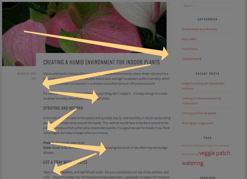
On the web, people don’t read. They scan. They skim the page from top to bottom in a rough F-shaped pattern, looking for meaningful cues that indicate whether a section is worth paying attention to.
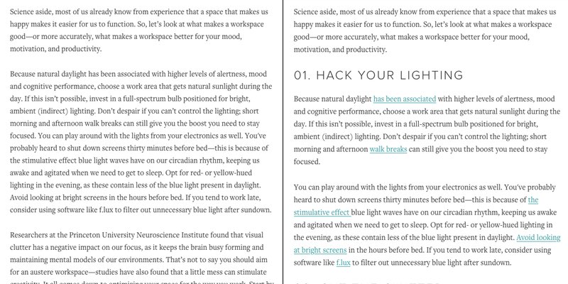
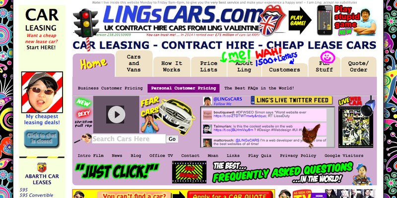
If you have a ‘wall of text’ (a body of visually uninteresting content), it camouflages those juicy key words and phrases, making it harder for readers to see that you’ve got useful information. Note the ‘wall of text’ effect in the sample at left below, compared to the more scannable section at right:
The Fix: Add visual variety with meaningful headings, text formatting, bullet lists, links, and images. Break up your post into short paragraphs, each focused on a single, simple point. This offers readers smaller pieces of information they can easily digest.
2. Bad typography
Both the size and style of your text can affect how your content is perceived and understood. Fortunately, most pre-made blog templates take care of this, but for writers creating or configuring their own templates, a bit of typography knowledge can go a long way in making good design decisions.
The Fix: Set your body copy font size to at least 12 points (14 is better). Smaller font sizes are harder to read and take more effort, so use them sparingly or strategically. Let readers know at a glance that a piece of text is interactive by coloring and underlining your links.
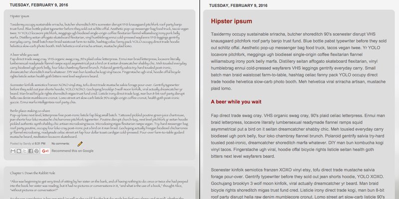
Choose a familiar and visually plain font, such as Times New Roman, Georgia, Helvetica, Arial or Verdana – or one of the similar, but more stylish, alternatives such as Lato, Roboto, Lora, Proxima Nova or Adelle. Avoid overly calligraphic fonts for body copy, as they add visual clutter and reduce text legibility.
Check out the difference in readability between this handwriting-style font at left and the plain one on the right:
If you’re going to write a heading that grabs attention, style it that way, too. Make your heading text bigger and bolder than your body copy, adding color if it suits your style.
Using a different font for headings helps them stand out, while also adding visual flair, as you see below. Be sure to choose a simple font that sends the right message to your readers.
3. Low contrast
Content that has little visual contrast may be hard for visually impaired users to read. You want your blog to be fully accessible, so every user can read it, right? Visual contrast is one easy goal all bloggers can achieve.
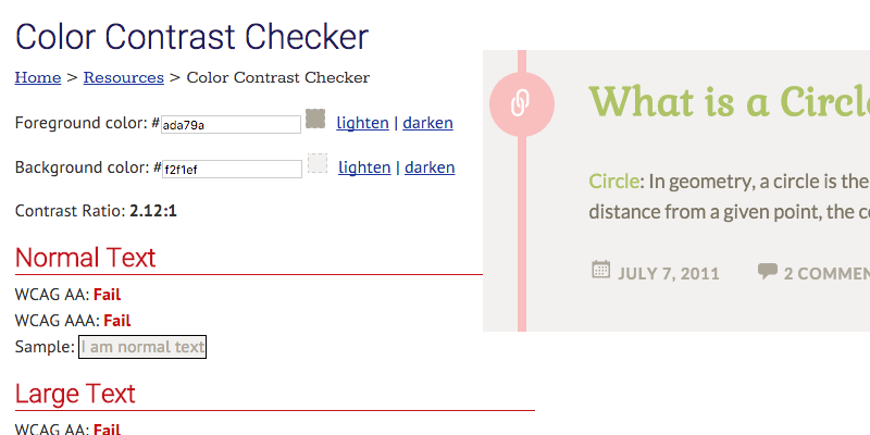
Contrast refers to the difference in the color and brightness between your text and its background. Low contrast reduces legibility, demands more effort, and can even give readers eyestrain. For visually impaired people, your low-contrast content may not be visible at all.
The Fix: You can analyze and improve your contrast with a tool like this one shown below:
Many beautiful blog templates sacrifice contrast for aesthetics. Use a color picker tool to grab the color codes for your text and background. Then, enter them into the checker to see if your content passes or if it fails to have enough contrast.
4. Poorly chosen line length and height
Would you believe line length can also affect the way people read your content? Too-long lines give readers fatigue. They may even lose their place when scanning for the start of the next line.
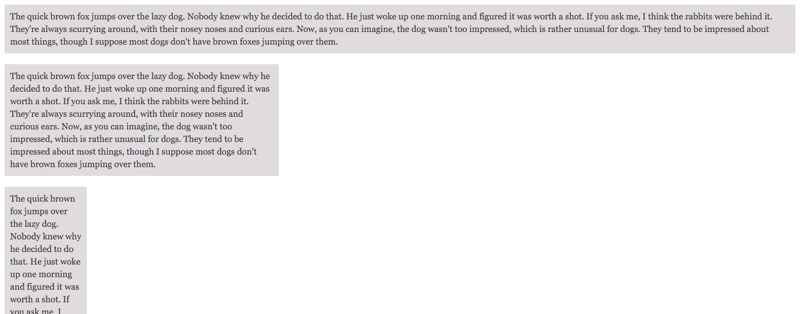
Too short, and readers are forced into unnatural reading rhythms and skimming patterns – another cause of fatigue. Take a look at how tiresome the top and bottom examples are here:
The Fix: I’ve got a rule of thumb for you – the optimum length for a single line of text is between 50 to 75 characters (including spaces). If your content has too many or too few characters, it may be worth adjusting your font size to improve readability – or adjusting your template.
If that’s not enough to think about, line height also affects blog usability. Too-tall line height reduces the cohesion of your content and creates extra distance for a reader’s eye to travel. Too-short line height looks cramped and cluttered, making the brain work harder to recognize letters and retain meaningful words and phrases.
Another design rule: Aim for a line height between 120-150% of your font size. Take a look below at how cramped the 110% line height looks at the left, compared to the 145% height at right:
5. Visual clutter
As we’ve seen, adding visual variety to your blog can improve the reading experience for your audience. However, overdoing it can backfire. Research shows visual clutter negatively affects our focus by increasing the cognitive load.
Content with too much going on can be difficult to read or see, making it that much harder to absorb and understand.
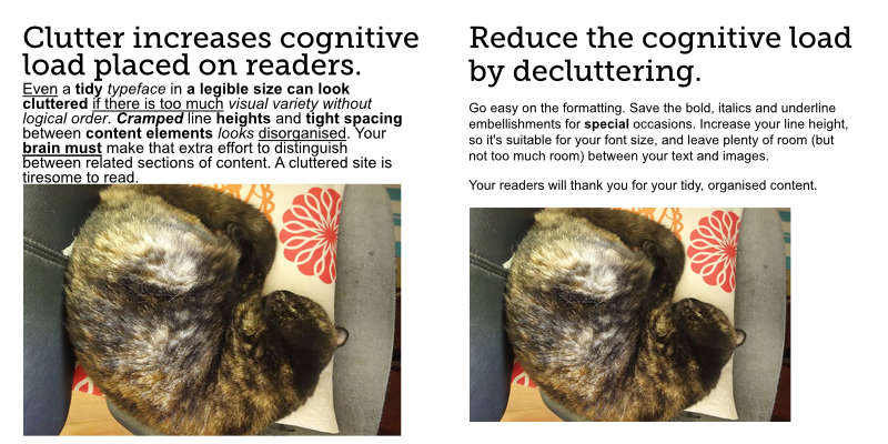
The Fix: Use bold, italics, and underlines as needed to convey emphasis and provide visual cues, but use them in moderation. Too much formatting both clutters your text and dilutes your attempts to emphasize key ideas.
Look at how cluttered the example at left appears compared to the one at right:
As with line height, take a Goldilocks approach to the whitespace between your text and images, your headings and body copy, and where your content sits relative to the edge of its frame.
Science reveals a lot about how our brains respond to visual input. After you’ve spent time perfecting your blog post, the last thing you need is to be let down by poor presentation. Pay attention to your site’s design and layout – it’ll make your work look good, and offer a great experience for your readers.
What’s your pet peeve of bad blog design? Tell us about it in the comments below.
Sandy Lim is a former web designer, content strategist, and UX specialist who now writes, crafts, and studies homesteading. Follow her @sandysandy.


